Choosing Blokchain Icons for Streamlined Project Design
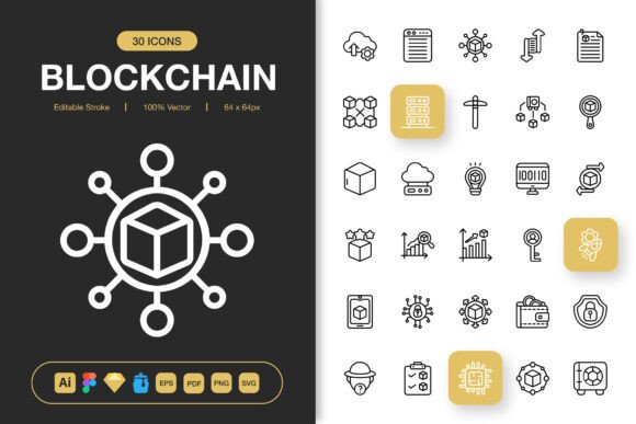
Finding a consistent icon family that works across web, mobile, and print without constant re-editing is still one of the quiet frustrations in digital design. Blokchain Icons enters that conversation as a minimalist set built to function across multiple environments right out of the folder. It is not a sprawling mega-library of tens of thousands of glyphs, but rather a curated collection of high-quality icons designed with an editable stroke foundation and delivered in formats that reflect how modern teams actually work.
What Blokchain Icons Actually Provides
At its core, this is a pack of customisable vector icons built around a clean, geometric aesthetic. The emphasis on minimalist icon design means the shapes avoid unnecessary ornamentation, which makes them easier to integrate into user interfaces, editorial layouts, and branded collateral without fighting existing visual systems. The stroke-based construction allows you to adjust weight, corners, and endpoints without degrading the original structure — a practical consideration that separates useful assets from decorative ones.
One detail that stands out during inspection is the delivery format list. The package includes source files for Adobe Illustrator, a Figma file, an Iconjar file, a Sketch file, EPS, PDF, SVG, and multiple PNG transparency sizes ranging from 32px up to 512px. This is not a pack that forces you into a single workflow. The inclusion of an Iconjar file specifically signals that the creator understands how icon management happens in practice, especially for teams maintaining design systems.
Editable Stroke and the Case for Real Customisation
Many icon packs claim to be customisable, but what that often means is recolouring a filled shape. Blokchain Icons takes a different approach by centering its construction around editable strokes. This matters because stroke-based icons can be resized with predictable behaviour, transformed from outlined to filled with a toggle, and adjusted for different screen densities without pixel-fitting guesswork.
For mobile app designers, this means icons remain crisp on both iOS and Android render targets. For print producers, it means the same icon can be thickened for small-format business cards or lightened for large-format banners without redrawing anything. The control sits with the user, not baked into a locked file. Being able to set stroke caps to round or butt, change join styles, or convert a line icon into a solid variation within minutes saves genuine production time when a brand guideline shifts mid-project.
Format Coverage and Workflow Compatibility
The file format spread deserves closer attention because it reflects realistic multi-software workflows. The Adobe Illustrator source file gives full editing access for those working in a traditional vector environment. The Figma file addresses the reality that many teams now design, prototype, and hand off within browser-based tools. Sketch compatibility remains relevant for legacy teams and certain agency pipelines. The EPS and PDF options offer broad import paths into older layout applications or corporate presentation tools that do not handle SVG gracefully.
PNG exports at seven different resolution breakpoints remove the need for manual rasterisation. When you are pulling together a quick social media graphic or building an infographic in a raster-based editor, having 128px, 256px, or 512px versions ready eliminates one of those small friction points that add up across dozens of assets. The SVG files maintain scalable quality for web deployment and can be dropped directly into codebases or animation tools without conversion.
Drag and Drop, But With Intention
The easy drag and drop functionality in Blokchain Icons is less of a gimmick than it might first appear. When icons are structured cleanly with consistent artboard sizing, logical layer naming, and predictable bounding boxes, dragging them from one application to another works reliably. Icons that break during transfer usually suffer from poor initial construction — nested clipping masks, unexpanded strokes, or artboards that do not match the visual bounds. The consistency here means the drag-and-drop workflow holds up across Illustrator, Figma, and Sketch without requiring cleanup passes.
Aesthetic Consistency Across Diverse Use Cases
The minimalist design language has a specific practical advantage: it ages better than trendy stylistic choices. A set that leans heavily into a particular illustration fad might look dated within two or three years, whereas geometrically balanced line icons tend to remain serviceable across interface refreshes and brand updates. This is not simply about looking "clean" — it is about reducing the visual variables that cause icons to feel mismatched when placed alongside typography, photography, or data visualisation.
The icon set is described as suitable for websites, mobile apps, books, social media, infographics, flyers, print, banners, and posters. That breadth is plausible here because the stroke weight and detail level sit in a middle ground that neither disappears at small sizes nor overwhelms at display scales. Icons used in a mobile navigation bar need enough heft to remain tappable and legible; the same icons in a poster headline need enough restraint to function as supporting elements rather than competing graphics. The editable stroke handles this tension by letting each user find the right weight for the context.
What 100 Customisable Icons Means in Practice
A set of 100 icons is not exhaustive, but it is focused in a way that larger libraries sometimes are not. Mega-packs with thousands of icons often suffer from quality drift — the first hundred look polished, the next several hundred less so. A tighter collection suggests more attention per asset, and that holds up when examining stroke consistency, corner radius uniformity, and optical alignment across the set.
The customisability angle extends beyond stroke editing. Because the source files are layered and structured, you can decompose icons into their component shapes, combine elements from different icons, or extract motifs to build new icons that share the same visual DNA. This is especially useful for startups or small teams that need to extend an icon set for niche features without commissioning entirely new work.
Practical Performance in Real-World Projects
In web projects, SVG implementation from this set works cleanly. The files export with sensible viewBox attributes, and the paths are not over-engineered with unnecessary points that bloat file size. For a site loading twenty or thirty icons on a single page, the cumulative payload remains manageable. Developers who inline SVGs for animation or theme colouring will appreciate that the stroke-based construction plays well with CSS stroke properties and JavaScript-based manipulation.
For print work, the EPS and PDF vectors separate properly in layout applications like InDesign or QuarkXPress. Spot colour assignments work as expected without trapping artifacts, and overprinting behaviour can be managed without rasterising vector elements. These are not glamorous details, but they are the kind that prevent a 2 AM production panic when a printer flags a file issue.
Social Media and Infographic Applications
Social media templates and infographics benefit from icon sets that do not impose a strong stylistic opinion. Blokchain Icons sits comfortably alongside data widgets, brand marks, and photographic content because its visual voice is understated. When you are laying out a carousel post or a multi-section infographic, icons that compete for attention force you to compensate with layout gymnastics. A quieter icon style lets the information hierarchy drive the design, which is usually the right call for content marketing and educational materials.
Who Gains the Most From This Icon Set
Freelance designers juggling multiple client identities will find the agnostic style and broad format support immediately useful. The same icon can serve a tech startup's app prototype on Monday and an educational publisher's textbook layout on Wednesday without clashing with either brand environment. Small business owners handling their own marketing collateral gain access to vector assets that do not require a design degree to resize and recolour, especially when working through the included Figma file.
Educators producing digital and print course materials will value the consistency across slide decks, handouts, and online learning platforms. Marketers building landing pages, email headers, and downloadable lead magnets can maintain visual coherence across touchpoints. Developers who occasionally need to produce UI mock-ups without a dedicated designer get a properly structured icon set that does not introduce technical debt into the asset pipeline.
Long-Term Value and Considerations
The included readme file might seem like a minor addition, but it signals something about the creator's approach to documentation. Knowing which file corresponds to which application, understanding any layer structure conventions, and having version notes reduces the time spent orienting to a new asset pack. This is one of those small things that separates well-packaged design resources from those that assume you will figure everything out through trial and error.
No icon set is universally perfect. A 100-icon collection will inevitably have gaps depending on the niche. If your project requires highly specialised medical, scientific, or industrial symbols, you may need to supplement with additional sets or custom work. The minimalist style, while versatile, may not satisfy brands that require more expressive or illustrative iconography. These are not flaws so much as scope boundaries worth understanding before purchasing.
The PNG transparency sizes cover the practical range well, though designers working on ultra-high-density displays or large-format signage at extreme dimensions may need to generate custom raster exports from the vector sources. Fortunately, the source files make that straightforward. The real long-term value rests in the editable vector masters — they remain current regardless of what screen resolutions or print specifications emerge in the coming years.
Weaving It Into Your Next Project
Switching an existing project to a new icon set mid-stream is rarely trivial, but adopting Blokchain Icons at the start of a project or during a planned redesign is worth considering if your current icon library suffers from inconsistent stroke weights, missing format support, or a visual style that has drifted from the rest of the brand. The immediate practical win is the time saved not rebuilding icons that should have been delivered in the right format to begin with.
For those curious about experimenting, starting with a small integration — perhaps updating the icon set across a single landing page or a presentation deck — provides a realistic test of how the icons perform within your specific constraints. Pay attention to how they render on different screens, how they feel alongside your chosen typeface, and how much adjustment the stroke weight needs before the icons feel native to your environment. The answers to those observations will tell you more than any general assessment can.
What makes Blokchain Icons worth discussing is not a single killer feature but rather the sum of practical decisions that went into its construction. Editable stroke architecture, multi-format delivery, sensible resolution coverage, and application-agnostic styling combine to produce a resource that fits comfortably into diverse production pipelines. It is the kind of asset pack that rewards designers who value control and consistency over decorative flair, and it quietly raises the baseline quality of whatever project it touches.