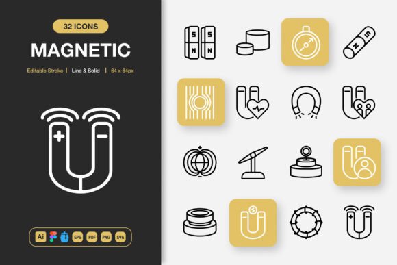
Magnetic Icons: Versatile Minimalist Design for Every Project
Visual communication often hinges on the smallest details. A well-chosen icon can clarify a complex idea, guide a user through an interface, or add polish to a printed flyer. When you work across different platforms and media, consistency becomes surprisingly hard to maintain. Magnetic Icons responds to that challenge with a cohesive set of high-quality icons built for real-world flexibility. The collection focuses on clean minimalist geometry, dual styling options, and practical file delivery that respects your workflow rather than forcing you into a single ecosystem.
What makes a icon set truly usable beyond a screenshot is how it handles stroke weight, scalability, and format support. With this package, you aren’t limited to a single visual language. You get both line and solid styles in the same family, so you can mix or match based on context without breaking visual harmony. Designers who regularly move between web, mobile, and print will immediately appreciate not having to hunt for matching pairs across different libraries. That cohesion saves real time and keeps branding tighter.
What Sets the Collection Apart
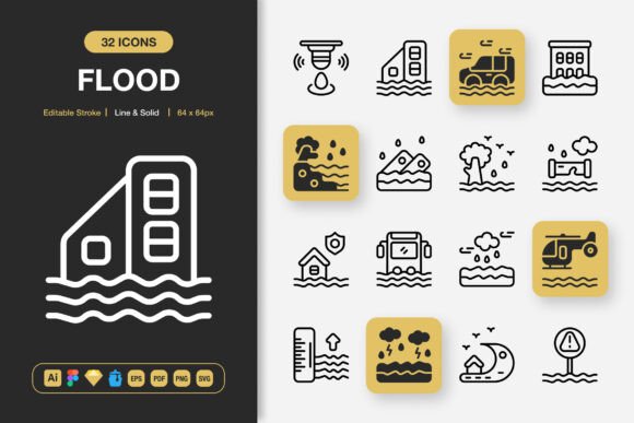
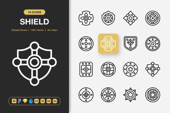
Many icon packs promise versatility, but few deliver the combination of editable strokes, high precision, and complete customization that a professional workflow demands. Magnetic Icons stands out because every icon is crafted on a consistent grid with uniform stroke weights, rounded caps, and balanced proportions. The editable stroke feature means you can adjust thickness after placement—no need to outline paths or rebuild shapes. That alone makes it easier to adapt a single icon for a website navigation bar (where a thinner stroke feels lighter) and a printed poster (where a bolder presence holds its own at larger sizes).
Quality matters when you scale an icon from a small mobile label to a large infographic focal point. These icons retain crisp edges and clear silhouettes because they are built as vector objects first. You won’t find misaligned nodes or odd corner radii that become painfully obvious at 400% zoom. The minimalist design language also ages well; stripped of heavy trends, the icons remain functional for long-term projects where you don’t want to rebrand every six months.
Line and Solid Style Under One Roof
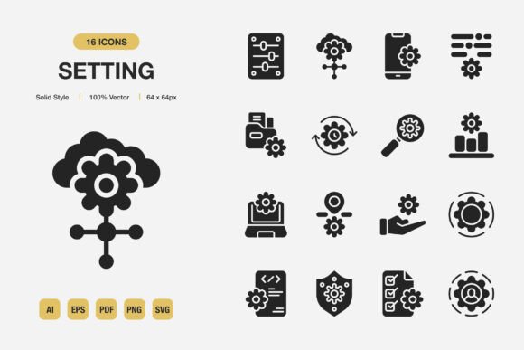
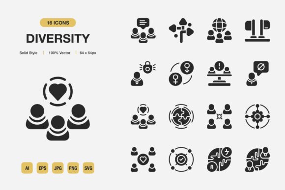
Having both line and solid variants within the same set solves a common design friction. A data-rich dashboard might use solid icons for primary actions and line icons for secondary labeling. A social media template might call for solid versions on dark backgrounds and line versions when placed over images. You maintain typographic consistency because both styles share identical shapes, spacing, and optical size. This dual-style approach also speeds up prototyping. Instead of testing two separate icon families that might look mismatched, you can quickly toggle between styles and see what communicates better in situ.
100% Customizable and Truly Editable
Customization goes beyond changing colors. The source files—Adobe Illustrator, Figma, and IconJar—allow you to dig into each path, adjust corner radius globally, or even extract partial shapes for custom symbols. If you need a slightly heavier bottom weight for a particular icon to sit correctly in a button, you can edit the stroke without breaking the entire icon. The EPS and PDF files serve as reliable archival formats and remain compatible with software that many print workflows still rely on. SVG and PNG transparency files cover digital and presentation needs with minimal friction.
For teams that use design systems, this level of editability means icons can be batch-processed through a color token system, exported with specific naming conventions, and integrated directly into component libraries. The included IconJar file is especially useful for quickly browsing, searching, and dragging icons into your preferred design tool without opening a master file each time.
Where Minimalist Icons Improve Daily Work
Icons live at the intersection of aesthetics and utility. A well-chosen icon doesn’t just decorate; it reduces cognitive load. When you scan a list of features, an icon next to each bullet gives your eye a visual anchor. In mobile apps, a recognizable icon in a tab bar can mean the difference between smooth navigation and user confusion. Magnetic Icons supports these practical needs across a wide spectrum of applications.
- Websites and landing pages: Use line icons for subtle section dividers, feature grids, or service highlights. Solid variants work well for call-to-action buttons or sticky navigation elements.
- Mobile app interfaces: Consistent stroke width and grid alignment ensure icons feel native whether on iOS or Android. No awkward padding adjustments needed.
- Books and editorial layouts: For sidebars, chapter markers, or infographics within a publication, the minimalist style complements text-heavy pages without feeling distracting.
- Social media graphics and stories: Quick drag-and-drop SVG or PNG files let you assemble posts that need visual cues—think carousel slides, Instagram Story prompts, or pinned tweet graphics.
- Presentations and pitch decks: Swap bullet points with relevant icons to keep slides clean and memorable. The solid style works better on darker presentation backgrounds.
- Print materials: Flyers, banners, and posters benefit from vector icons that scale to any size. EPS and PDF files ensure no resolution surprises at the printer.
- Infographics and data visualization: Use icons to label chart categories, illustrate process steps, or replace generic shapes with meaningful symbols.
- Educational content and e-learning: Icons help break down concepts for learners, especially in video overlays, worksheets, or module roadmaps.
Easy Drag and Drop That Respects Your Tools
One understated advantage of a well-organized icon pack is the drag-and-drop convenience. Whether you work in Figma, Sketch, Adobe XD, or even Keynote, having multiple file formats means you spend less time converting or reformatting. The PNG transparency files give you a quick raster option when vectors aren’t needed, while SVG files inject directly into code or web-based tools with minimal overhead.
For developers who hand-code SVG, the clean markup behind these icons helps avoid bloated paths. You get readable, optimized code that can be further styled with CSS when inline SVGs are used. That matters for performance and accessibility, especially if you serve icons system-wide. The Readme.txt file provides guidance on file naming and usage, which small teams or solo developers will find useful during integration.
Maintaining Brand Consistency Without Extra Effort
Brand erosion often happens through small inconsistencies. One department uses a thin icon set, another pulls from a free library with totally different visual weight, and suddenly the brand feels patchy across touchpoints. A unified set like Magnetic Icons eliminates that drift. Because the icons are built on the same grid and share geometry across styles, everything feels like it belongs to one family. You can set up a brand asset folder once, with color-preset versions for web, print, and social channels, and let teams self-serve without risking off-brand choices.
When onboarding freelancers or contractors, providing the IconJar file or Figma library cuts down on back-and-forth questions. They simply open the organized collection, pick what they need, and stay within the established visual language. This consistency becomes particularly valuable for businesses that produce regular content across multiple platforms—blog posts, email newsletters, video thumbnails, and downloadable guides all benefit from a recognizable iconographic style.
Realistic Observations From Daily Use
After working with the icon set across several projects—a small marketing website redesign, a mobile app prototype, and an annual report—a few practical strengths emerge. The editable stroke feature let me dial back the line thickness slightly for the report where body text was set at 10pt, making the icons feel less heavy next to light typography. For the mobile app, I used solid icons in the tab bar and line icons everywhere else, creating a natural hierarchy without additional design effort.
The Figma file organization deserves a mention. Icons are grouped logically and named clearly, which made it easy to link them as components in our design system. When we needed to update the primary color across dozens of screens, we changed the parent component once, and every instance followed. That might sound basic, but with poorly named or scattered icon files, such updates can turn into a tedious afternoon task. Here, it took seconds.
No icon set covers every niche, and it’s wise to check that the symbols you need most frequently are included before committing to any library for a long-term project. That said, the breadth of common categories in this pack—technology, business, media, food, travel, and everyday objects—covers the majority of typical use cases without pushing into overly specialized or trendy territory that quickly dates.
How to Evaluate and Integrate the Icons Sensibly
Before dragging icons into a live project, consider the context they’ll inhabit. Test a few on actual backgrounds—light, dark, photographic—to see how the stroke weight reads at intended sizes. The minimal style shines when paired with simple, modern typography but can also work alongside more expressive design elements if you let generous white space breathe around them.
Pay attention to how icons work in multi-language interfaces. Symbols that rely on cultural metaphors might not translate universally, so choose symbols with clear, widely recognized meanings for global products. The minimalist approach in Magnetic Icons tends to strip away culture-specific details, which actually helps with broad comprehension. An envelope, a phone, a settings cog—these retain their meaning across regions.
For large-scale projects, take advantage of the source files to create a small customized subset. Extract only the icons you need, convert them to your preferred naming convention, and package them as a lightweight library. This reduces file bloat and keeps your design files nimble. The original master file remains untouched and can serve as a reference for future expansions or when you need an icon you had not initially included.
A Practical Addition to Your Design Toolkit
Whether you’re a freelance designer juggling client work, an in-house marketer producing weekly content, or a product builder refining an app interface, the right icon set influences the speed and quality of your output. Magnetic Icons doesn’t overpromise; it provides clean, adaptable symbols with the raw files you actually need. The combination of line and solid styles, fully editable strokes, and broad format support makes it a sensible choice for professionals who want to spend less time sourcing assets and more time refining the message they deliver.
The package includes everything from source Adobe Illustrator and Figma files to IconJar, EPS, PDF, SVG, and PNG transparency files—all accompanied by a clear Readme. That kind of delivery acknowledges that real work happens across different tools and environments. Minimalist icon design isn’t about being plain; it’s about being clear, efficient, and reliably consistent. When your icons work as hard as your words do, the entire project feels more considered.