Not Found Page Icons for Clearer User Communication
Designing a thoughtful 404 page often moves to the bottom of priority lists. Yet that single screen shapes how visitors perceive a brand when something breaks. The Not Found Page Icons collection tackles this exact gap, offering more than a generic broken link graphic. It provides a deliberate set of symbols that turn a dead end into a guided moment, while staying useful across dozens of other contexts. For anyone who has ever hesitated to ship a project because the error-state visuals felt off, this resource deserves a closer look.
What the Icon Set Actually Includes
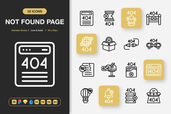
Beneath the product name lies a robust toolkit built for multiple workflows. The download comes with over 100 icons, each delivered in line and solid style variants. That dual-style approach alone solves a frequent problem: finding matching icon treatments across different interface surfaces without hunting through scattered libraries.
The packaging is unusually generous. Creatives receive source files for Adobe Illustrator, Figma, Sketch, and Iconjar, alongside EPS, PDF, and SVG versions. PNG files arrive in seven predefined sizes—32px, 48px, 64px, 96px, 128px, 256px, and 512px—all with transparency. A single readme file ties everything together. This format spread respects how teams actually work, removing the friction of converting assets after purchase.
Two technical features stand out immediately: editable stroke and easy drag-and-drop behavior. The stroke weight can be adjusted without breaking the icon structure, making the set much more flexible than static SVG batches. Drag-and-drop readiness matters whether you are assembling a wireframe in Figma or building a final layout in Illustrator.
Practical Strengths Beyond the 404 Screen
The most immediate advantage is consistency in distress. When a visitor lands on a not-found page, the icon must do three things: acknowledge the error without alarm, reinforce the brand’s visual language, and hint that navigation can continue. The line-style illustrations in this pack handle that with a neutral, professional tone. They avoid cartoonish panic or cold technical diagrams—a balance that keeps users calm instead of driving them toward the back button.
Because the icons are not locked to a single metaphor, they expand naturally into related scenarios. Use the same asset family for empty states, search-without-results modals, maintenance announcements, or permission-denied screens. This reuse saves decision fatigue and preserves visual coherence across an entire web application or mobile product.
Another practical strength is scalability without quality loss. The EPS and SVG files remain crisp from 16px favicons up to large-format prints for banners or posters. Having pre-sized PNGs removes guesswork for non-designers who need to drop an icon into a social media graphic or a PDF report without touching vector software.
Editable Strokes and Real-World Design Flexibility
Icon sets that look polished in previews often fail when placed into a live project with its own stroke conventions. The editable stroke feature eliminates that risk. If your interface uses a 1.5px stroke system, you can match it. If a dark-mode background demands thinner lines for legibility, you can adjust in seconds. This control turns the collection from a static decoration into a living asset that adapts to your design tokens.
Combining line and solid styles within the same project also opens up subtle interaction patterns. A navigation icon could remain in line style while the active state switches to solid, creating a responsive feel without loading a separate icon set. That kind of quiet cohesion contributes to a polished user experience without extra licensing overhead.
Who Gains the Most Value
This asset is not reserved for a single audience. Several groups will find the purchase directly improves their daily output.
- Web and mobile app designers who maintain large component libraries. The consistent grid and naming conventions shorten the time needed to implement error states, empty views, and status indicators.
- Freelancers and agency teams working across diverse client industries. An editable, all-in-one icon set means fewer one-off purchases and faster turnaround for landing pages, dashboards, and marketing collateral.
- Small business owners managing their own Squarespace, Shopify, or WordPress sites. The PNG transparency files let them quickly update a 404 page or blog graphic without hiring a designer.
- Educators and content creators developing slides, handouts, or online courses. Clean icons for “page not found,” “no data,” and “error” concepts help explain abstract ideas while keeping materials visually tidy.
- Print and infographic designers who need scalable vectors for flyers, posters, and data visualizations. The EPS and PDF formats slot directly into professional print pipelines.
Figma and Iconjar: Team Workflows Made Smoother
Including a Figma file acknowledges how central collaborative design tools have become. Multiple team members can inspect, copy, and override icon properties without leaving the design environment. The Iconjar file is equally thoughtful for macOS users who prefer organizing icons outside a full design suite. These format decisions suggest the creator anticipated real production environments, not just a static asset dump.
Quality, Consistency, and Presentation
Evaluating icon quality comes down to optical balance, grid alignment, and how cleanly shapes communicate at small sizes. Across the 100+ icons, the proportions hold steady. Rounded corners, termination angles, and padding remain uniform, which indicates a disciplined construction process rather than batch auto-generation. When icons share this level of consistency, placing them side by side in a design never reveals awkward mismatches.
The presentation goes beyond the artwork itself. Each file format is properly organized with layers where applicable, and the readme explains file contents without marketing fluff. That straightforward documentation reduces frustration during integration, especially for non-specialists who may not know the difference between an SVG and an EPS until they are asked to use one.
Effectiveness Across Devices and Media
Because the PNG set includes sizes from 32px up to 512px, the icons serve both responsive web headers and high-resolution Retina screens equally well. In mobile app contexts, small interactive icons benefit from the crisp 32px and 64px options, while the larger sizes become useful for onboarding illustrations or empty-state spot graphics without introducing pixelation.
Print uses are just as practical. The EPS and PDF vectors import cleanly into InDesign or Affinity Publisher for flyers, brochures, and event banners. Since the icon themes cover more than just 404 pages—including search, security, notifications, and file management—you can build a full visual system for a printed user guide or a conference poster from a single icon family.
Long-Term Value and Project Scalability
Assets that carry long-term value share a key trait: they do not lock you into a specific tool or platform. With Illustrator, Sketch, Figma, and open formats like SVG and PDF represented, switching design software years later does not render the purchase obsolete. The editable stroke foundation means even if operating system iconography trends shift toward lighter or heavier weights, you can update the visuals without sourcing a completely new set.
For growing businesses, this scalability matters. A startup might initially use five icons on a simple website and later expand into a full-fledged app with dozens of states. The same original set can grow with the product, saving the time and expense of license chasing or style realignment.
Realistic Scenarios Where the Icons Perform Well
Consider an e-commerce manager who notices a high exit rate on the 404 page. Instead of writing custom CSS and hunting for a single acceptable image, they can grab a properly sized PNG from the pack, upload it via the CMS, and add a short message. The result looks intentional, not patched together. That small change can reduce bounce rate and keep potential customers in the purchase funnel.
In a SaaS dashboard, a data visualization fails to load due to a permission error. A developer can insert one of the solid-style icons to communicate the issue clearly, matching the existing icon system already styled with editable strokes. The user understands what happened and knows they can retry, rather than staring at an empty gray box.
An educator creating a PDF workbook needs a visual cue for “resource not available.” They import the SVG into a word processor, size it down to 64px, and the printed page remains legible. The line style does not overpower the surrounding text, maintaining a clean instructional tone.
Practical Recommendations and Observations
While the collection performs well overall, a few observations help set realistic expectations. The icon themes lean toward digital communication and system status rather than niche industry objects. If your project requires hyper-specific illustrations like agricultural machinery or medical devices, this set will supplement rather than replace those needs. However, for the vast middle ground of web, app, marketing, and educational design, the coverage feels generous.
It is also worth noting that using editable strokes effectively requires at least a basic familiarity with vector editing. Design newcomers might initially stick to the premade PNG sizes, which is perfectly fine. As their confidence grows, the vector source files offer room to refine.
For legal clarity, the readme file typically includes licensing details. Always verify that your intended use—commercial, personal, client work—aligns with the terms provided. Based on similar asset packs, the license is usually broad enough for most professional scenarios, but a quick check avoids complications.
Integrating the Icons Without Disrupting Your Workflow
Because the download does not rely on a proprietary plugin or a cloud platform, integration is straightforward. Designers can add the Figma file to an existing project library, while developers can drop SVG files directly into a component folder. The PNG transparency images work with Canva, Google Slides, email builders, and video editors. This tool-agnostic approach fits the reality that most projects involve multiple software tools stitched together.
When working on a tight deadline, the predictable file structure saves searching. Everything is sorted by format, and the included previews help pick the right icon quickly. That organization is a subtle but meaningful detail that pushes the set past utility and into genuine workflow improvement.
Final Thoughts on Choosing the Right Icon Resource
The Not Found Page Icons set earns its place not because it promises to revolutionize design, but because it solves a specific, repeated problem with thoroughness. It acknowledges that a missing page is a moment of friction and gives designers the tools to make that moment less jarring. Beyond that, its dual styles, editable strokes, and cross-format compatibility make it a dependable everyday asset for a much wider range of visual communication tasks. Whether you are refreshing a single website, building a client’s brand kit, or preparing educational materials, having one well-organized icon source reduces micro-decisions and keeps the focus on what matters: clear, effective user experiences.